Selected projects

The outcome comes first.

Each project starts with a decision somebody needs to make. The data model, interaction, and visual language follow from there.

dashboard / report
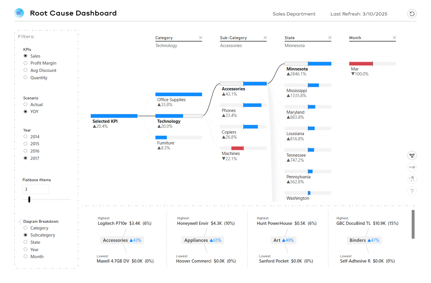
Root Cause Analysis dashboard

Case study 01

Root Cause Analysis Dashboard

Move from top-level variance to the drivers behind it—without waiting for an analyst.

A decomposition tree, fishbone diagram, jitter plot, and impact-ranking visual give users four ways to investigate the same business problem.

Power BIDAXSVGDeneb
dashboard / report
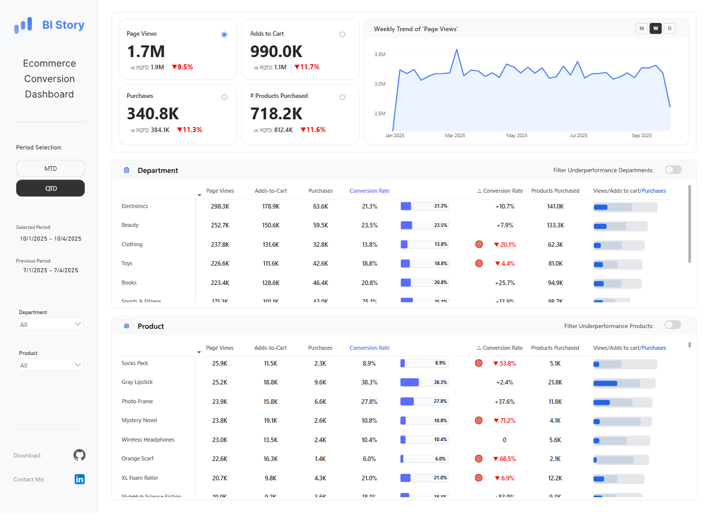
Ecommerce conversion dashboard from the design library

Case study 02

Power BI Design Files

A reusable open-source library that has earned 350+ GitHub stars.

Dashboards, themes, backgrounds, DAX patterns, and custom visual techniques—documented so developers worldwide can study and reuse them.

Power BIDAXSVGFigma
dashboard / report
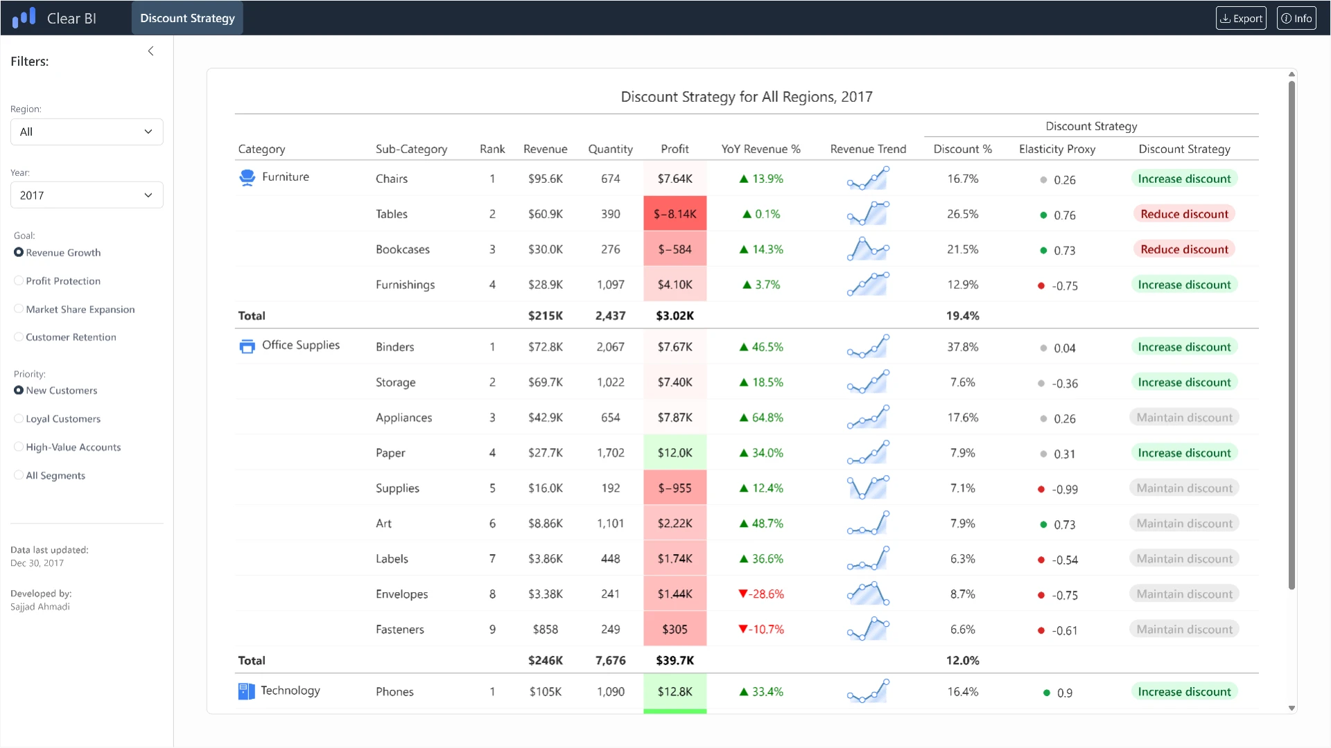
Discount Strategy dashboard built with Quarto and Shiny for Python

Case study 03

Discount Strategy Dashboard

Turns pricing guesswork into a defensible discount recommendation for each segment and region.

Price elasticity, customer segments, regional performance, company targets, and historical trends are analysed together, so the recommended discount arrives with the evidence behind it.

QuartoShiny for PythonPythonPandas
dashboard / report
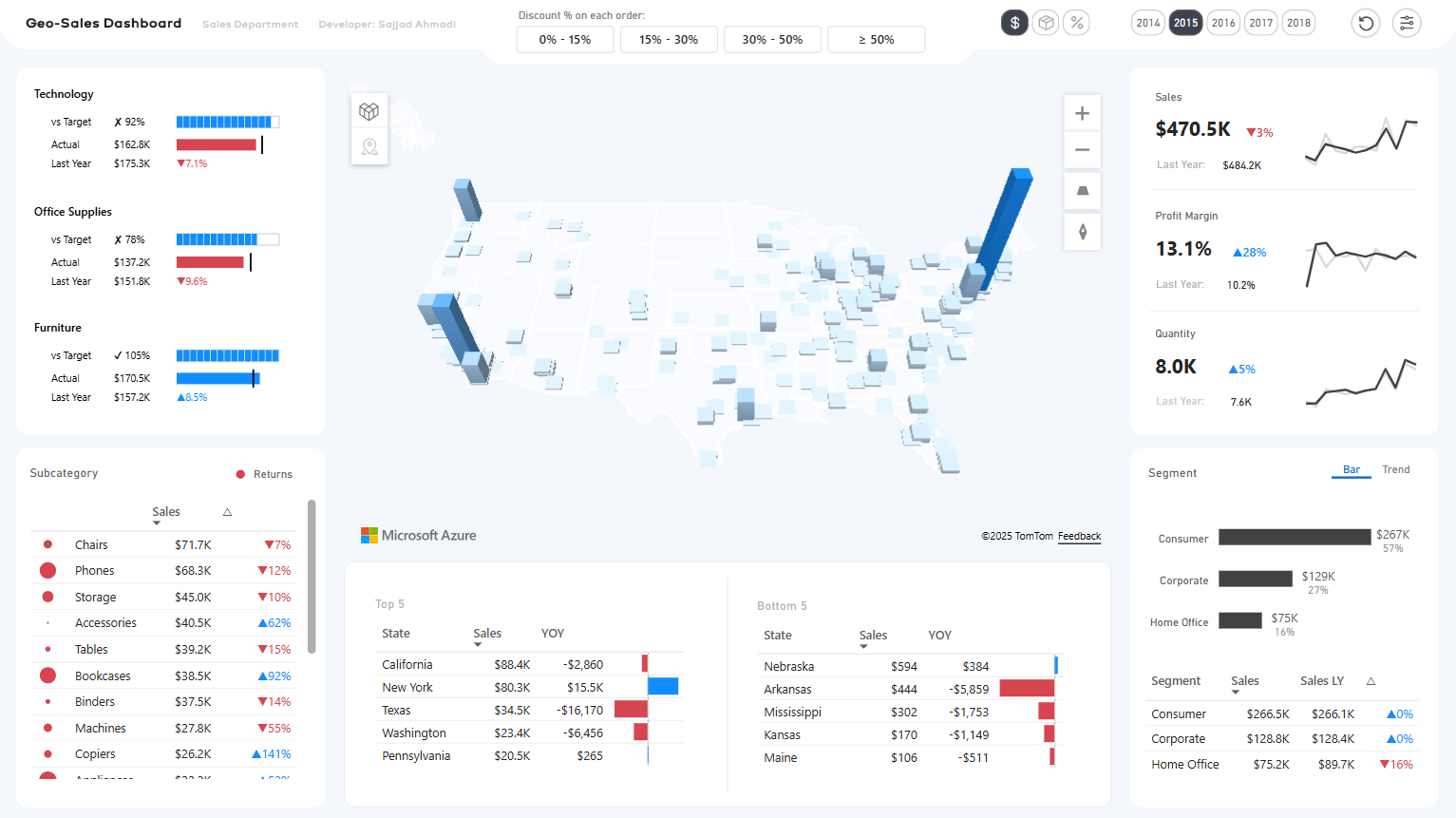
Geo-Sales Power BI dashboard using Azure Maps with 3D column layers

Case study 04

Geo-Sales Dashboard — Azure Maps

Regional sales read as geography, not as a table of place names.

Azure Maps and the HTML Content custom visual are pushed well past defaults—cluster bubbles, 3D column layers, and heavy styling make territory performance readable at a glance.

Power BIAzure MapsHTML ContentDAX
dashboard / report
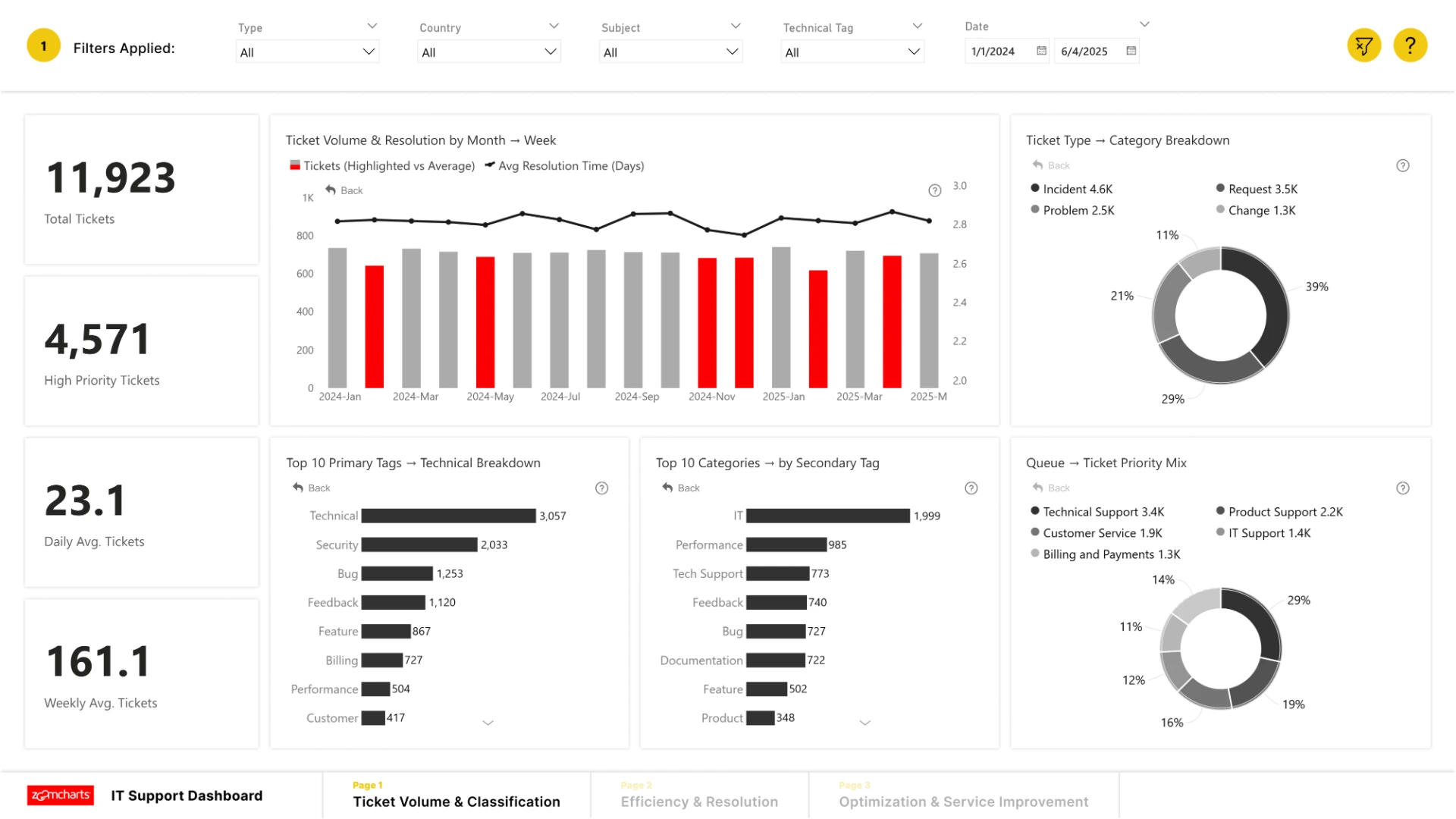
IT Support Performance dashboard showing ticket volume, resolution time, categories, and priority metrics

Case study 05

IT Support Performance Dashboard

Connects ticket demand to resolution performance and service improvement priorities.

The analysis moves through ticket volume and classification, efficiency and resolution, then optimization opportunities—giving support leaders one structured view of operations.

Power BIDAXPower QueryUX Design
dashboard / report
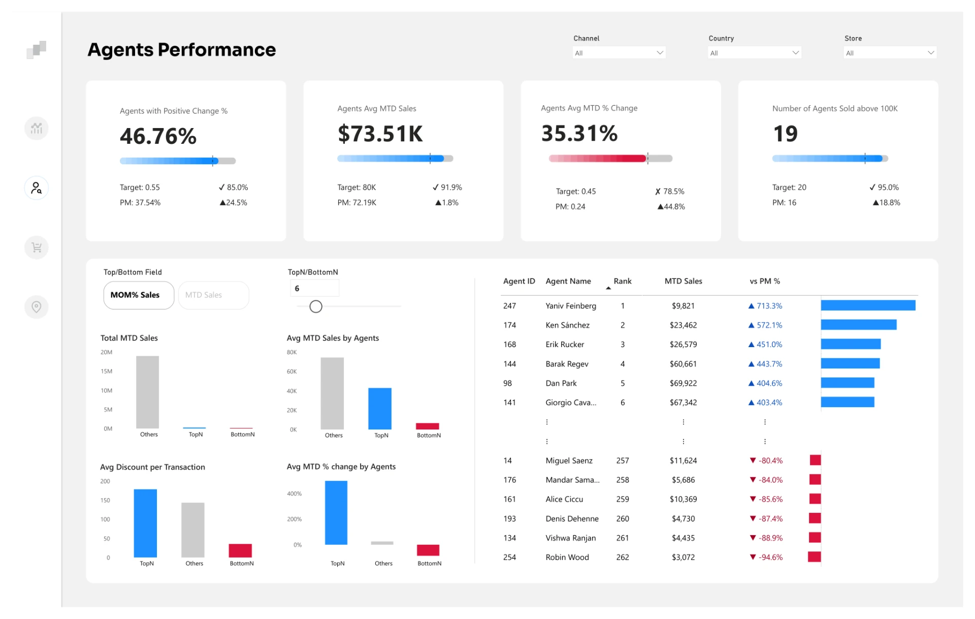
Agents Performance dashboard comparing top and bottom agents across key metrics

Case study 06

Agents Performance Dashboard

Surfaces the highest- and lowest-performing agents across the metrics that matter.

Top and bottom performers appear in the same visual, making it faster to compare conversion, revenue, satisfaction, and activity without switching views.

Power BIDAXPerformance AnalysisUX Design
dashboard / report
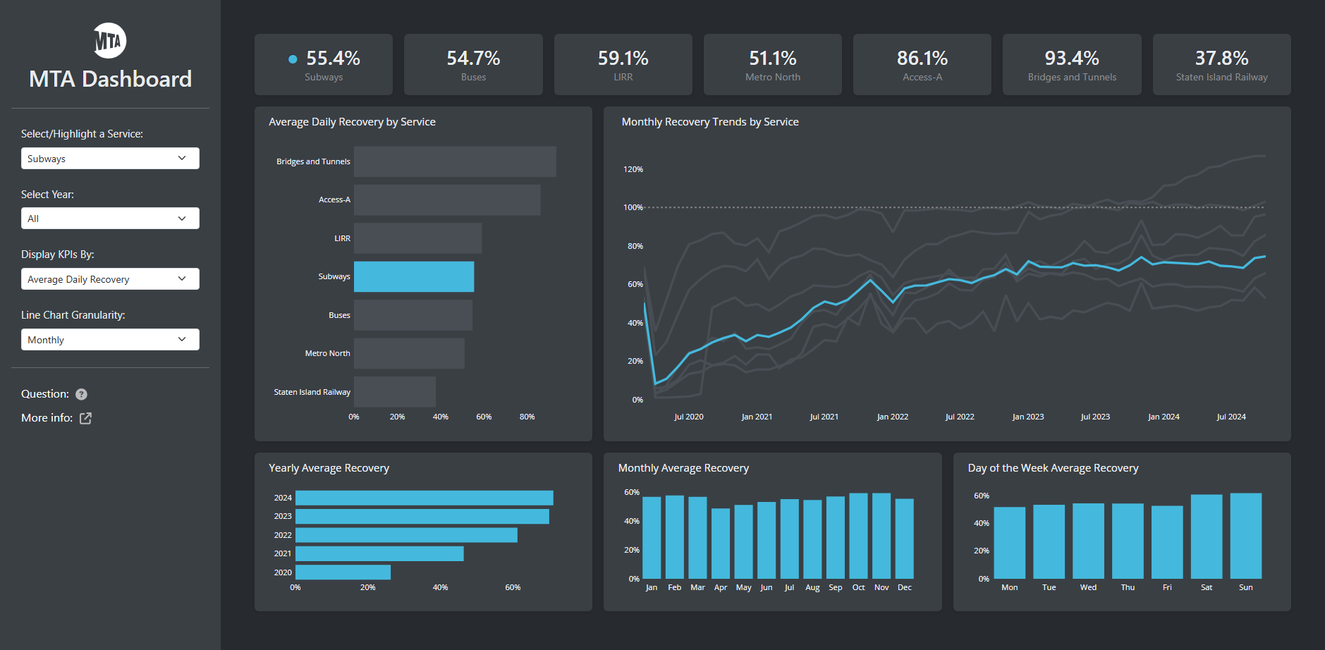
MTA Recovery dashboard tracking post-COVID transit recovery rates and trends

Case study 07

MTA Recovery Dashboard

Shows how New York City transit services recovered after COVID across modes and time periods.

Interactive filters connect recovery rates, ridership trends, and service-level KPIs so transit performance can be compared by mode, date, and reporting period.

PythonDashPlotlyPandas
dashboard / report
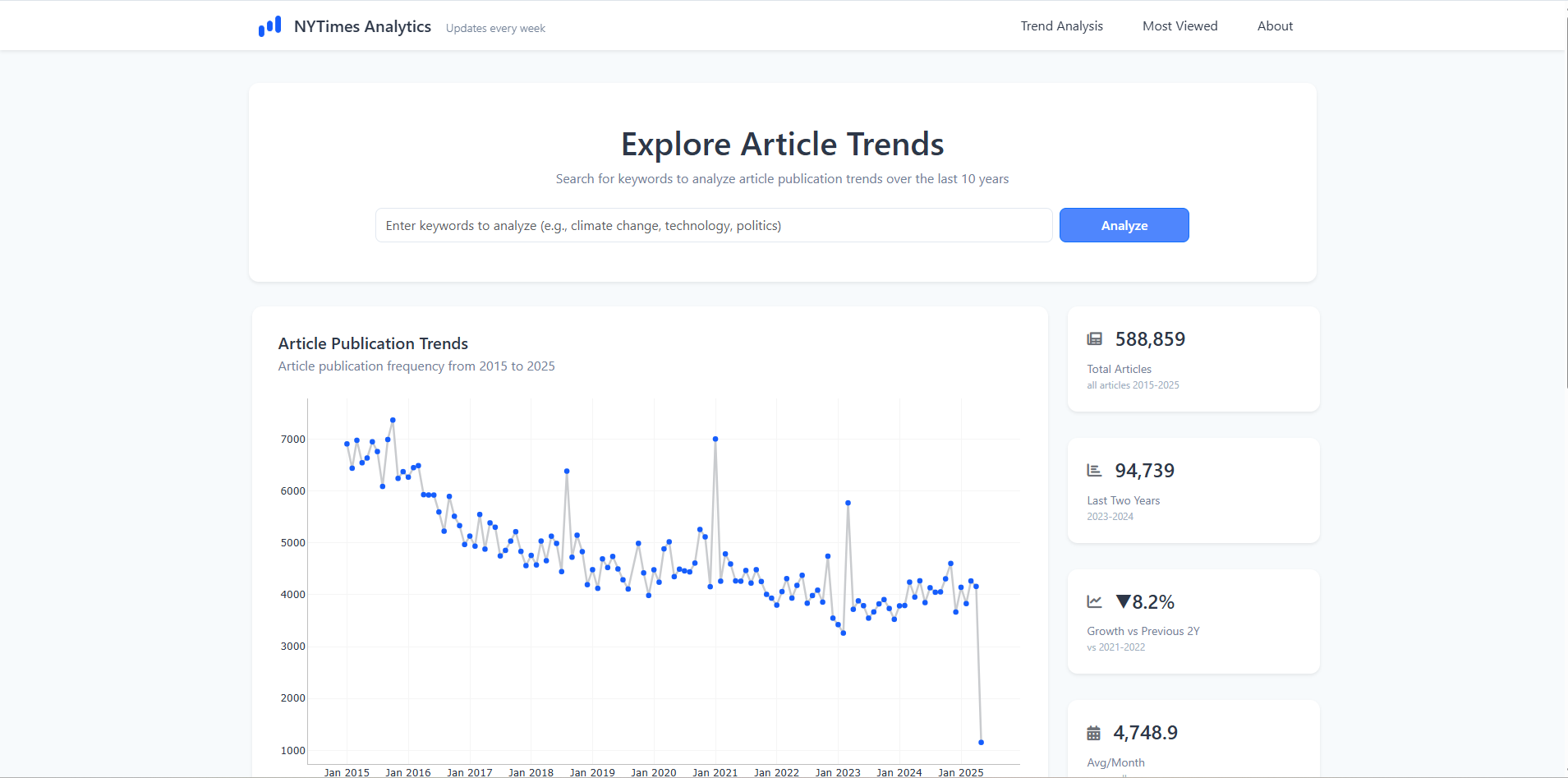
New York Times Articles dashboard showing publication trends and article metrics

Case study 08

NYT Articles Dashboard

Makes 15 years of New York Times publishing trends searchable and comparable.

The interactive dashboard analyzes article volume, recent activity, growth, and most-viewed stories from 2010 to 2025 through a focused research interface.

PythonDashBootstrapData Analysis
dashboard / report
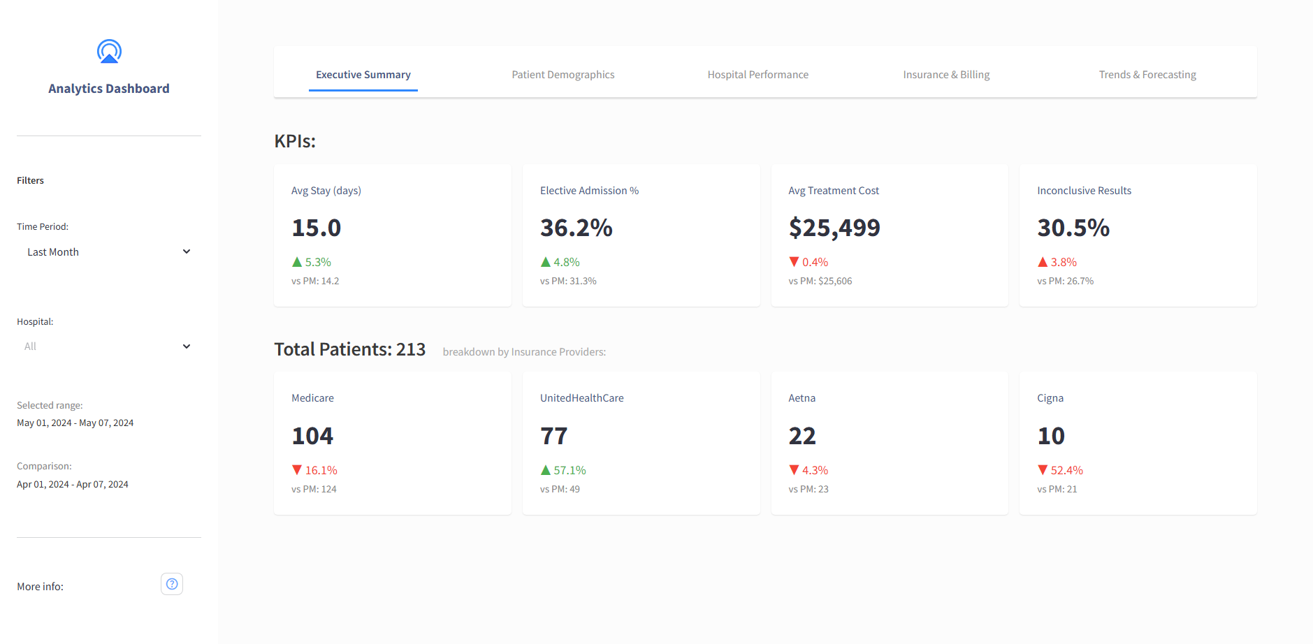
Healthcare Analytics dashboard showing hospital billing and insurance-provider analysis

Case study 09

Healthcare Analytics Dashboard

Turns 55,500+ patient records into operational and financial signals across 10 U.S. hospitals.

Hospital performance, patient clustering, insurance providers, and billing patterns are brought together to support better resource planning and billing optimization.

PythonStreamlitPandasHealthcare Analytics
dashboard / report
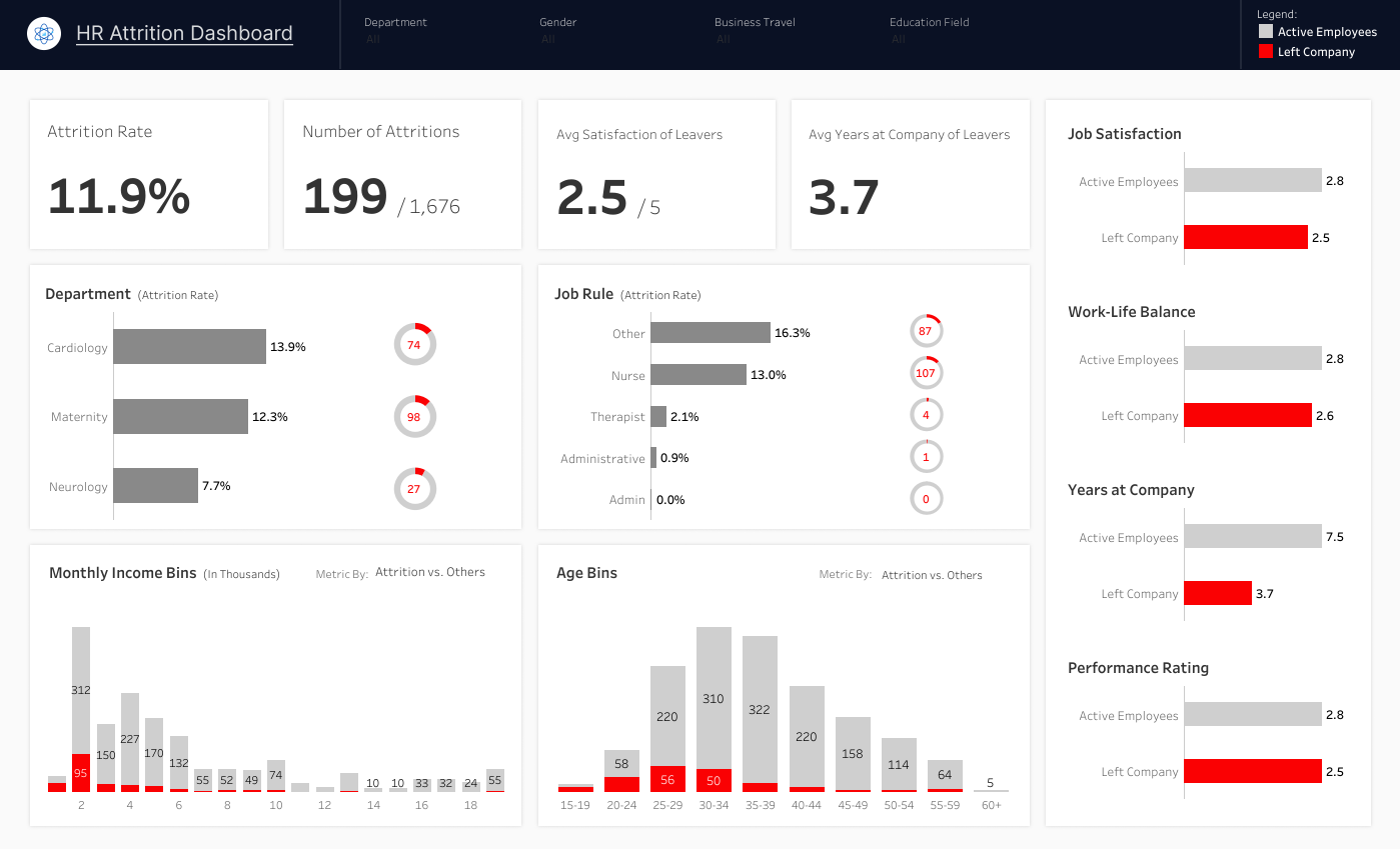
HR Attrition Tableau dashboard comparing employees who left with active employees

Case study 10

HR Attrition Dashboard

Explains who is leaving—and how their experience differs from active employees.

Attrition rate, age, tenure, satisfaction, work-life balance, income, department, and job role are compared in one Tableau view to reveal retention risks.

TableauHR AnalyticsData VisualizationUX Design
dashboard / report
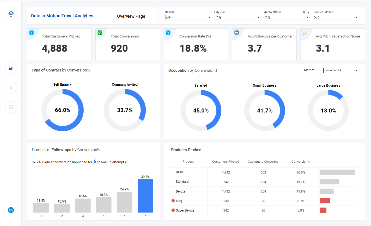
Executive customer conversion dashboard for Data in Motion Travel Analytics

Case study 11

Executive Dashboard for Customer Conversion Insights

Identifies the customer profiles and behaviors most strongly associated with conversion.

Data in Motion travel analytics connects conversion rate, customer satisfaction, occupation, product choice, and follow-up attempts in an executive-ready Tableau view.

TableauConversion AnalyticsCustomer SegmentationUX Design
dashboard / report
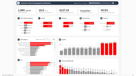
Customer Churn Tableau dashboard showing churn across demographics and tenure

Case study 12

Customer Churn Dashboard

Shows which customer groups are most exposed to churn across demographics and account value.

Churn rate, age, city, tenure, gender, contract type, and recurring revenue are compared to help telecom teams identify retention priorities.

TableauCustomer ChurnSegmentationData Visualization
dashboard / report
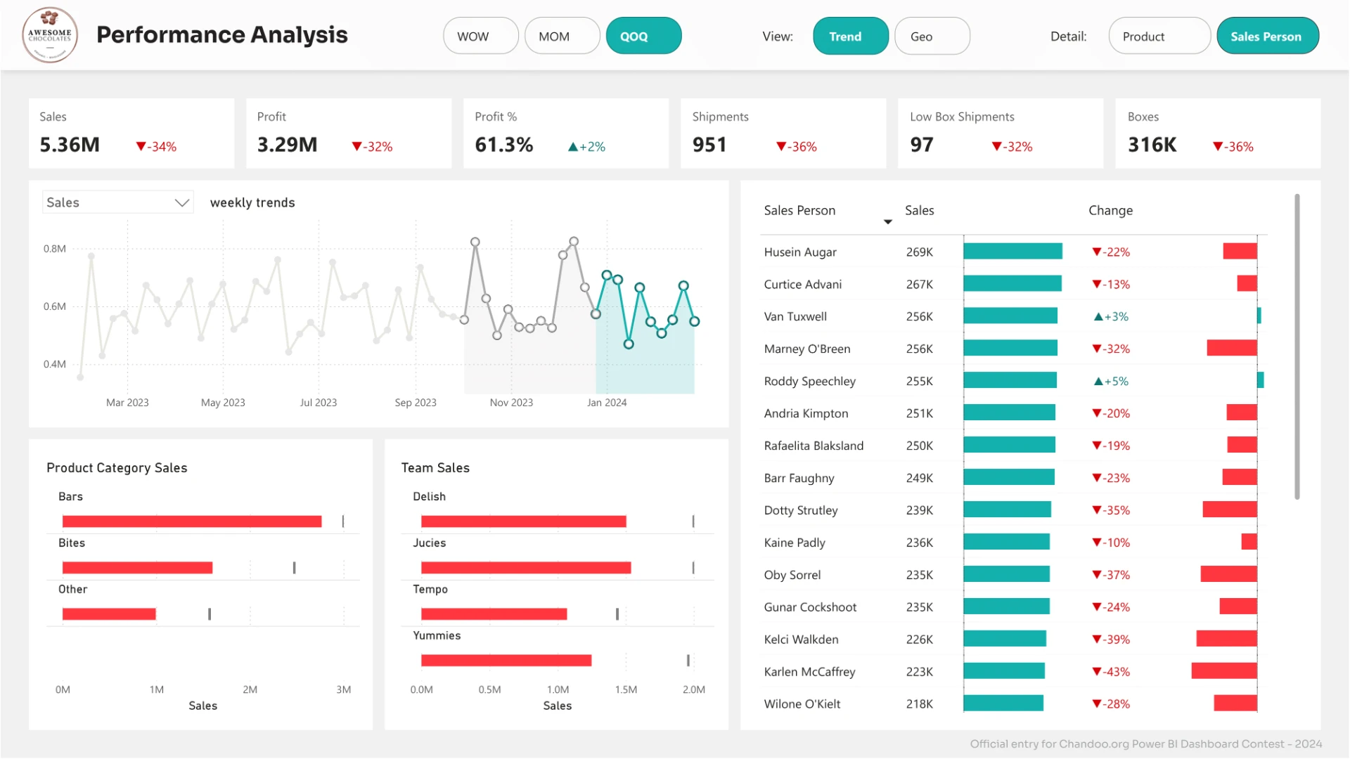
Awesome Chocolates sales performance dashboard showing sales, profit, shipments, product categories, teams, and salespeople

Case study 13

Sales Performance Dashboard

Gives the CEO a direct view of sales, profit, shipments, and salesperson performance.

Weekly trends, product and team sales, low-box shipments, and salesperson results are brought together so leadership can spot underperformance and act quickly.

Power BIDAXSales AnalyticsExecutive Reporting

Have a reporting problem?

Let’s turn it into a decision-making tool.

Send a Message